Customization
You may customize message cells like this:
ChatView(messages: viewModel.messages) { draft in
    viewModel.send(draft: draft)
} messageBuilder: { message, positionInGroup, showAttachmentClosure in
    VStack {
        Text(message.text)
        if !message.attachments.isEmpty {
            ForEach(message.attachments, id: \.id) { at in
                AsyncImage(url: at.thumbnail)
            }
        }
    }
}
messageBuilder’s parameters:
message- the message containing user info, attachments, etc.
positionInGroup- the position of the message in its continuous collection of messages from the same user
showAttachmentClosure- you can pass an attachment to this closure to use ChatView’s fullscreen media viewer
You may customize the input view (a text field with buttons at the bottom) like this:
ChatView(messages: viewModel.messages) { draft in
    viewModel.send(draft: draft)
} inputViewBuilder: { textBinding, attachments, state, style, actionClosure, dismissKeyboardClosure in
    Group {
        switch style {
        case .message: // input view on chat screen
            VStack {
                HStack {
                    Button("Send") { actionClosure(.send) }
                    Button("Attach") { actionClosure(.photo) }
                }
                TextField("Write your message", text: textBinding)
            }
        case .signature: // input view on photo selection screen
            VStack {
                HStack {
                    Button("Send") { actionClosure(.send) }
                }
                TextField("Compose a signature for photo", text: textBinding)
                    .background(Color.green)
            }
        }
    }
}
inputViewBuilder’s parameters:
textBindingto bind your own TextField
attachmentsis a struct containing photos, videos, recordings and a message you are replying to
state- the state of the input view that is controled by the library automatically if possible or through your calls ofactionClosurestyle-.messageor.signature(the chat screen or the photo selection screen)
actionClosureis called on taps on your custom buttons. For example, callactionClosure(.send)if you want to send your message, then the library will reset the text and attachments and call thedidSendMessagesending closuredismissKeyboardClosure- call this to dismiss keyboard
Modifiers
If you are not using your own messageBuilder:
type - type of chat, available options:
- chat: input view and the latest message at the bottom
- comments: input view and the latest message on top
showDateHeaders - show section headers with dates between days, default is true
avatarSize - the default avatar is a circle, you can specify its diameter here
showMessageMenuOnLongPress - turn menu on long tap on/off
showNetworkConnectionProblem - display network error on/off
tapAvatarClosure - closure to call on avatar tap
messageUseMarkdown - whether the default message cell uses markdown
mediaPickerSelectionParameters - a struct holding MediaPicker selection parameters (mediaType, selectionStyle, etc.)
assetsPickerLimit - the maximum media count that the user can select in the media picker
enableLoadMore(offset: Int, handler: @escaping ChatPaginationClosure) - when user scrolls to offset-th message from the end, call the handler function, so the user can load more messages
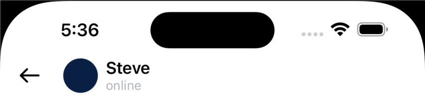
chatNavigation(title: String, status: String? = nil, cover: URL? = nil) - pass the info for the Chat’s navigation bar
showMessageTimeView - show timestamp in a corner of message
messageFont - pass cutom font to use for messages
availablelInput - full (camera + attachments + text + audio) or textAndAudio
Example
To try out the Chat examples:
- Clone the repo
git clone git@github.com:exyte/Chat.git - Open terminal and run
cd <ChatRepo>/Example - Wait for SPM to finish downloading packages
- Run it!
Swift Package Manager
dependencies: [
    .package(url: "https://github.com/exyte/Chat.git")
]
CocoaPods
pod 'ExyteChat'
Carthage
github "Exyte/Chat"
Requirements
- iOS 16+
- Xcode 14+
Our other open source SwiftUI libraries
PopupView - Toasts and popups library
Grid - The most powerful Grid container
ScalingHeaderScrollView - A scroll view with a sticky header which shrinks as you scroll
AnimatedTabBar - A tabbar with number of preset animations
MediaPicker - Customizable media picker
ConcentricOnboarding - Animated onboarding flow
FloatingButton - Floating button menu
ActivityIndicatorView - A number of animated loading indicators
ProgressIndicatorView - A number of animated progress indicators
SVGView - SVG parser
LiquidSwipe - Liquid navigation animation